The project
UX design for an app that enables its users to create their custom discount code database. The users receive these promo codes via email through subscription services, online shops, as well as flyers and mailers.
Once the user creates their own database, the app then notifies them when a promo code is about to expire.
Idea and inspiration
The main idea and purpose of the app is to deal with the issue of missing the expiration date of these promo codes. That way its users won’t let them pass unused and go to waste.
The goal of the app
- Create a custom database of promo codes for its users where they can have an overview and access them from a single place
- Notify its users when a promo code is expiring so that they get a chance to use it on time
User persona
Age is not that relevant here – the app is made for both male and female and anyone from 18 to 65 who loves to browse and shop online, subscribes to services from theater and music events to electronic stores. Enjoys saving money and using the benefits of discount codes. Therefore, more tech and internet shopping oriented audience and someone who loves buying with discounts. This brings a need to make the app design as universal and practical as possible.
User flow
- The users put in promo discount codes in the app manually after they receive them in digital form (e.g. via email) or physical form (e.g. on a printed flyer)
- They can then add the details for each code, like where to use it, which store or service it is for, how much is the discount, when is the expiry date, add notes and categories. All these details will help them use the code, as well as quickly find and filter the codes in the database when needed.
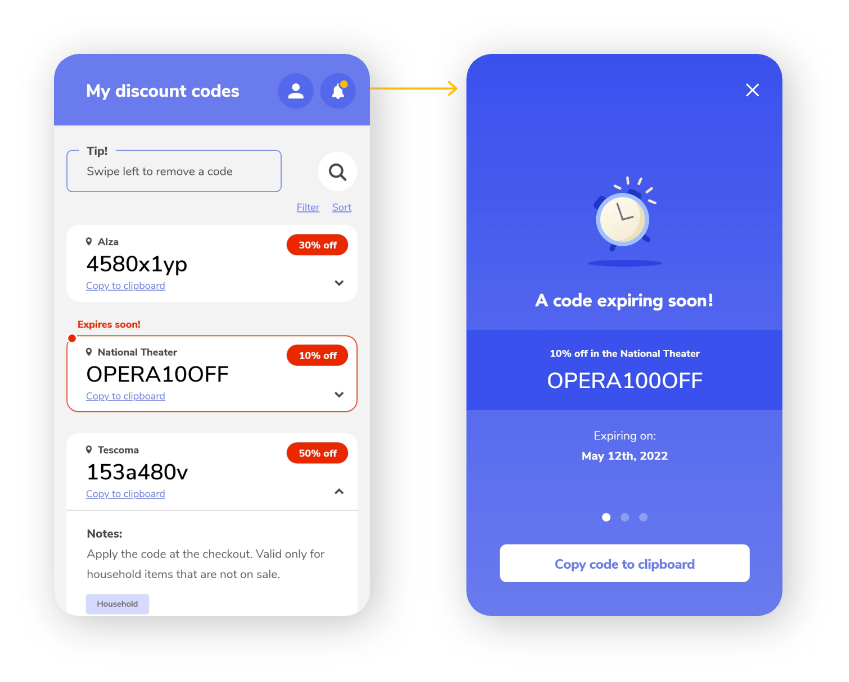
- After the database is created, the app notifies the user in the database list when a code is expiring soon (5 days before the expiration date)
- When the code is even closer to the expiration date (2 days before), the user can click the notification icon in the top menu that becomes active and that triggers a notification alert screen. This screen reminds them about the last chance to use the code.
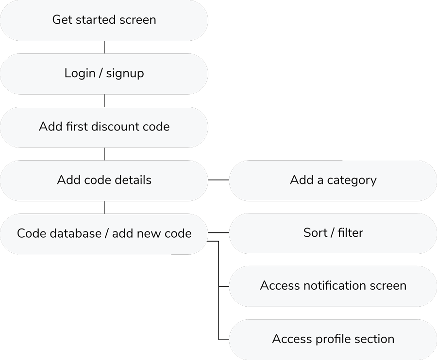
Common actions like adding a new code, sorting, filtering and swiping to delete a code are integrated in the app.
The design
The design is kept extremely simple and technical, straight to the point, with clean color scheme and centered around the promo code details and usability.
It uses a light color scheme, airy design and lots of white space.
Blue color scheme is universal, appropriate for a wide range of users while giving it a trustworthy look. Grey tones give it a bit softer look and clean, crisp fonts provide enough contrast and readability.

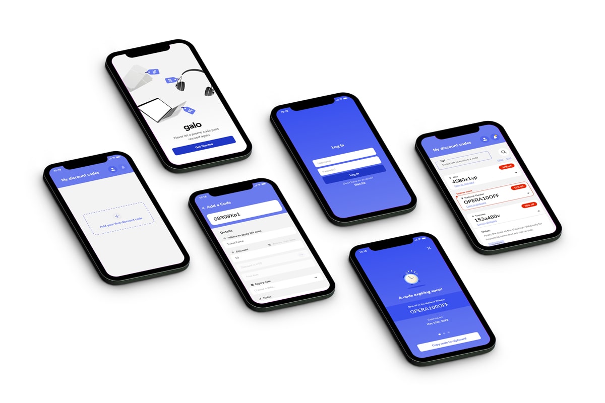
Database screen
This is the main screen of the app and kind of a ‘home screen’ that appears when a user opens and logs in the app. It is the promo code database or ‘My discount codes’ screen.
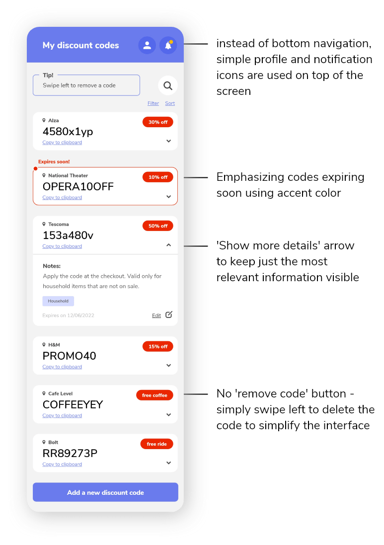
From this single screen, users can access their profile details, notification screen (reminding them about the expiring code), have an overview of all the codes in the database, edit them or view their details or add a new promo code.
To simplify the layout and number of elements, the bottom navigation is removed and replaced by simple notification and profile icons in the top bar.
The search icon is minimalistic, easily found on top of the screen and triggering a search pop up.
The codes are organized in a card view. When the cards are collapsed, they are showing only the essential information to keep the look condensed and clear. This main information contains:
- The code itself
- Where the code can be used
- How much is the discount
- ‘Copy to clipboard’ for easy usage of the code in the browser
Upon clicking on the arrow in the promo code card, more details are available, such as category and notes for each code.
Once a code is about to expire (5 days before the expiry date), its corresponding card is highlighted with red, accent color and ‘Expires soon!’ reminder above it. This visually draws attention of the user. When the expiry date is even sooner – 2 days before the code expires, a notification bell then appears with a dot in the top panel and reminds the user to trigger a notification screen.
Simplifying the interface:
- Instead of adding an ‘x’ or ‘delete’ button to each code in the database, there is a simple ‘swipe left to remove code’ principle to free up the space for showcasing the code details.
- Bottom menu is removed and simplified to just ‘profile’ and ‘notification’ icon to maximize the space used for the codes and simplify the design.
- Most relevant information structure for each code showing in the database: the code itself, where to use it (name of the store or event – consider changing this to website link?), how much is the discount for and ‘copy to clipboard’ to quickly use the code online.
Alert screen triggering
When the code expiration date is approaching, the notification symbol in the top bar becomes active and appears with a dot. Upon clicking this bell icon, an alert screen reminding the user about this expiry date is triggered.
Add a new code screen
When adding a new code, the most prominent field on the screen is the code field itself. To distinguish it from the rest of the fields, it is kept on blue background. It is followed by the code details, such as which store or facility to apply to the code at, how big is the discount, when is the expiry date, custom notes and categories.
When inputting the discount, the users have the option to choose between percentage, fixed amount or free items that the code provides them with. If the ‘Amount’ is chosen, the corresponding field gets active and if the user wants to customize the currency of the amount, they can simply add a new currency by clicking the ‘…’ button on the right side of the input field.
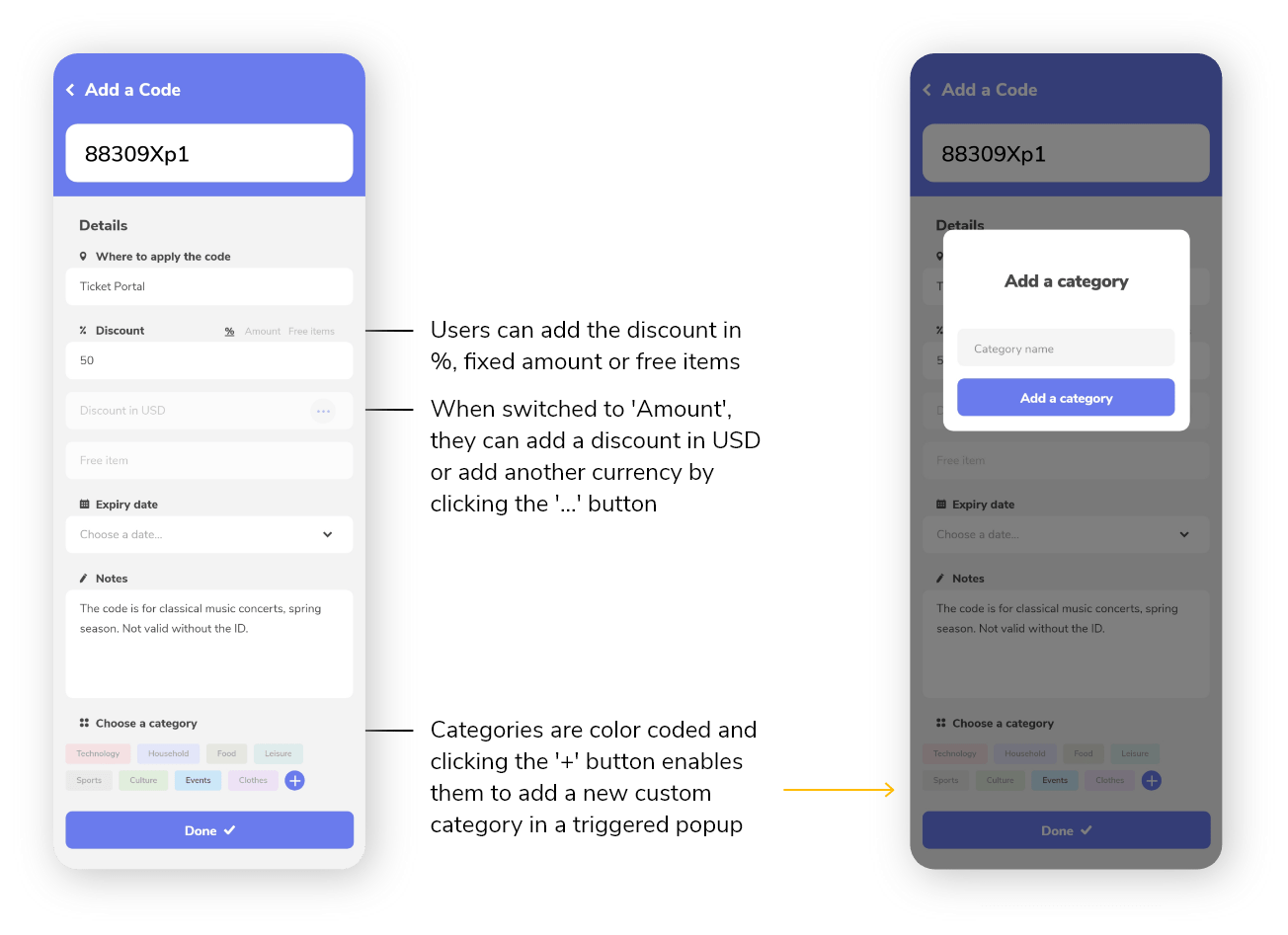
Categories are color coded and users are able to add custom categories by clicking the ‘plus’ button in this section. That, again, triggers a ‘Add a new category’ popup.
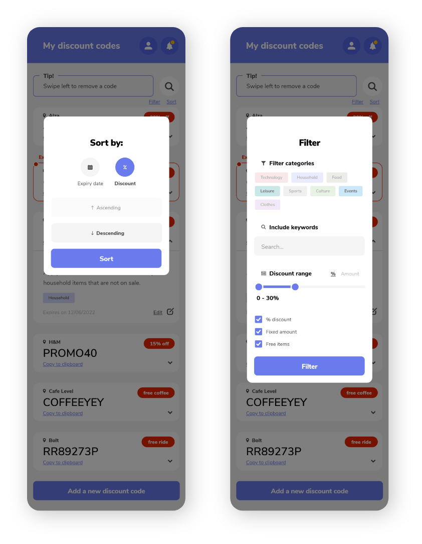
Filter and sort pop up screens
Upon clicking the ‘filter’ and ‘sort’ links from the main database screen, a pop up is triggered. These pop ups have an inverted color scheme – white background with light grey fields as opposed to light grey background with white fields / cards from the regular screens.
Sorting is possible by either expiry date or discount value.
Filtering on the other hand is possible by categories, discount range, discount type using a checkbox system and including specific keywords.
Final screens
Possibilities for improvement based on user testing:
- Add ‘See code details’ on the ‘Code expiring soon’ notification screen
- Some users preferred having a website link in the code details instead of ‘Where to apply the code’ field
- Including both details from above might however make the design too cluttered