6 best unique, modern, elegant serif fonts

How to give your design that sophisticated, luxurious and expensive feel to it? One of the first stops is to use elegant, modern, unique serif display fonts for titles and headlines. Elegant, thin, modern serif fonts with thin lines are always a treat for the eyes. You’ve seen them on wedding or event invitations, packaging … Read more

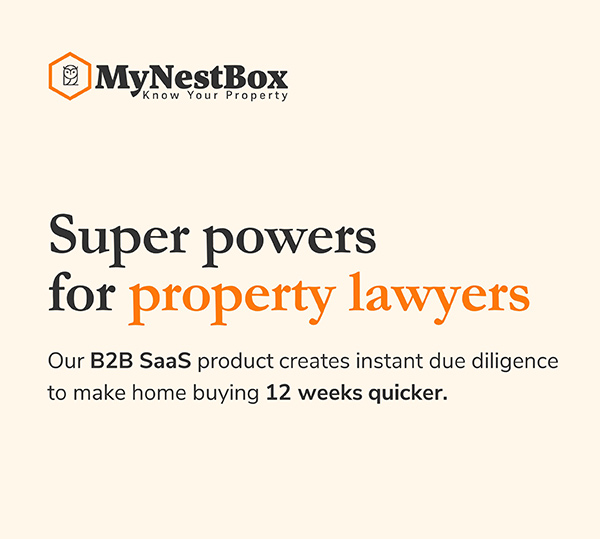
MyNestBox

Category: Investor deckIndustry: Real-estate and property management A flat, bright presentation design for property lawyers. Simple, straightforward and with contrasting black, big titles and light colored backgrounds.

Zapyrus

Category: PowerPoint presentation designIndustry: Medical / tech Bright, bold, dynamic and yellow – a PowerPoint presentation made to help companies find their MedTech partners. Dynamic, diagonal shapes and slanted dividers compliment the strong, yellow and black color scheme. The presentation has a lot of contrast, alternating white, yellow and black sections and custom, playful icons … Read more

Give something back to Berlin

Category: Print BrochureIndustry: Non-profit A bold, fun and colorful trifold brochure for a non-profit dealing with inclusion of migrants in the community. It features a deconstructed logo whose irregular polygon shapes and colors are used as main elements and background. Image masks and playful icons compliment the overall fun look.

Create posts with different, custom background colors in Elementor PRO and Advanced Custom Fields

This post will teach you how to create posts with different, custom background colors using Elementor PRO and Advanced Custom Fields plugin. This way, each post will have its own, individual, unique background color. All while following the same post template. Something like on my website https://vitaminbase.eu/ (see the GIF below): Check this video on … Read more

Atlas

Category: Social MediaIndustry: Product Development A series of colorful and bold Linkedin ad square posts for a new product launch, helping grow and onboard global teams. The ads are bright and with strong colors, bold, with screenshots and circular images of happy employees. Global character is indicated by flags and currencies of different countries. Layout … Read more

Campfire

Category: PowerPoint presentation designIndustry: Mental health, tech A sleek presentation deck for an app for a new social media platform. Youthful feel appealing to young audience, looking for supportive environment and benefiting their mental health.

Reconnext

Category: PowerPoint presentation designIndustry: Technology A corporate presentation design for a sleek PowerPoint deck. Clean, light look and various shades of blue, as well as green and yellow make it fresh and give a slightly soft, yet still corporate feel. The circuit graphic on the left provides a custom feel and ties together the overall … Read more

galo app

Category: App Design Industry: Commerce UX and UI design for a simple app with a tech feel. The app is about creating a database for promo discount codes and reminding / sending alerts to the user about the ones that are about to expire. It’s all about clean and simple design, slightly tech look and … Read more

Galo app UX case study

The project UX design for an app that enables its users to create their custom discount code database. The users receive these promo codes via email through subscription services, online shops, as well as flyers and mailers. Once the user creates their own database, the app then notifies them when a promo code is about … Read more

Rare Earth Magnets Infographic

Category: InfographicIndustry: Environmental Illustration showing the recycling process of rare earth magnets and how it benefits the environment and the Earth. The circular theme with the Earth (globe) in the center demonstrates the recycling process and points out the benefit for the environment. The style is illustrative and light, with 5 steps and arrows placed … Read more

Twine

Category: Pitch deckIndustry: Technology A sales deck with bold, technology feel to it. Dark backgrounds with alternating white / light theme, using abstract digital technology background as a supporting visual. Clean, minimalistic, modern look with lots of air and space and simple, direct layout with lots of contrast.

Graded

Category: Investor deckIndustry: Education A modern PowerPoint pitch deck made for an educational startup in online tutoring. Clean, sleek layout, blue tones and white and crisp, bold elements give this presentation a tech feel. Lots of charts, iconography and graphics help visualize the data. Overall light theme with lots of white space and colorful elements.

legal-i

Category: Investor deckIndustry: Technology A sleek and modern pitch deck design for investors with a dark, technology feel, for a startup in law accelerating medical insurance cases. A PowerPoint presentation with a clean, crisp and professional look and dark blue tones, gradients and isometric illustration on the cover slide. Subtle iconography on alternating dark and … Read more

legal-i website

Category: Web Design Industry: Insurace Law A clean and sleek website design for a startup in medical insurance law. With a tech feel to it, it features lots of white space, airy layout, blue tones, yet with friendly and fresh feel. Playful icons and alternating white and light grey sections give it a light and … Read more

Carbliss

Category: PowerPoint presentation designIndustry: Food & Beverage Sleek presentation design for premium vodka cocktails. Dark, bold theme with alternating white slides and strong colors used as accents bring life to the deck. Bold imagery of alcoholic drinks in combination with big titles give this presentation a fresh and modern look.

MAUI

Category: Brochure designIndustry: Premium airline A direct mail piece in form of a trifold brochure for a private air service. Luxurious, minimal look with an ‘invitation-only’ feel, focused on light, white theme and simple, yet effective layout. Featuring images of aircraft and exotic travel destination.

Vitaminbase infographic

Category: Investor deck / pitch deckIndustry: Health and Nutrition An infographic piece showing nutritional values of different fruits. It depicts the amount of Vitamin A in each fruit in minimal, black and white tone. Comes as part of the series on all vitamins and minerals percentage in different fruits, vegetables, nuts and legumes.

Cocktails infographic

Category: InfographicIndustry: Food and Beverage An infographic poster showing which ingredients make which alcoholic cocktails. Using minimal, linear style, with lines connecting each ingredient with the corresponding cocktail and colorful, light theme.

Live a life you love

Category: Social MediaIndustry: Motivational Series of instagram images for Live the Life You Love. Background images with interesting text treatment are used to represent inspirational quotes on each one.

Vitaminbase

Category: Social MediaIndustry: Health and Nutrition Social media posts as a series of animated infographics pointing out benefits and nutritional profile of different fruits, vegetables and nuts for vitaminbase.eu. From photo editing and color treatment to animating the information, the overall look is fresh, bold and colorful.

South of Fifth

Category: Email designIndustry: Real estate Email design for a real estate company, keeping a modern and minimalistic look. Bold contrasts, big titles and strong imagery are the core of this design. Touch of playfulness on the titles, lots of white space and careful placement of elements provide a polished and modern, editorial look.

General instructions:

  1. Open the exercise in your browser and read the task and the content on the left side of the screen. 
  2. You will be editing the content on the right side of the screen.
  3. In order to do that, right click on the exercise page that you opened and go to ‘Inspect’.
  4. Go to ‘Sources’ in the top bar and if you cannot see an empty CSS sheet where you can type the code, press Ctrl + P and start typing ‘styl’ in the search bar. Then press enter to open the CSS sheet.
  5. Follow the notes on the left and start typing your CSS code to see the changes online!
  6. Important! Do not refresh the page while you are editing the code, as these changes are in preview mode only and you can see them immediately, as soon as you write a line of functioning code.
  7. Use the custom classes in the notes on the left side of the screen, as well as ‘Elements’ on the top bar of the ‘Inspect’ to target and style the classes and elements. For example, you can enable the small icon on the top left of the ‘Inspect’ window (‘Select an element in the page to inspect it’) to find the default class name of the element you want to edit, while you are in the ‘Elements’ tab.

Tips:

  1. If the code is not showing any changes, try adding the !important tag at the end of the line before closing it (before the “;” symbol) and see if it works then.
  2. Don’t forget there are usually more ways to achieve the same result. Be creative!
  3. If you get stuck, write your email address in the form on the left side of the screen and you will get the solution (CSS code) in your email.

Sources:

  1. You can find a lot of tutorials on my youtube channel. 
  2. Watch the tutorial on how to solve these exercises here.

Please check your email and stay tuned for updates on the course.

We will notify you shortly when it’s available for presale.