In this tutorial, you will learn how to make horizontal tab titles on mobile and make them stick on top of your tab section using Elementor Pro and CSS.
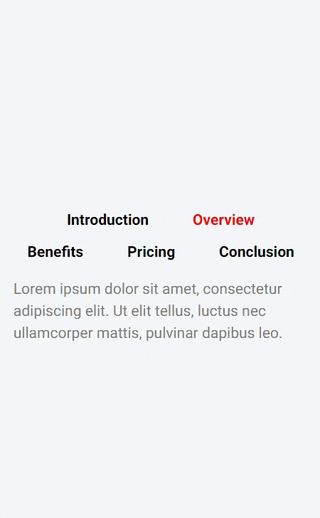
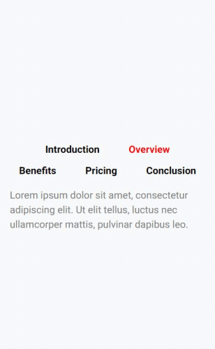
This is the end result we will be getting on mobile view:
Keep reading or watch the video below!
I am using Elementor Pro version that enables me to directly put my CSS code in the widget section.
If you are using Elementor FREE version, you can use one of the free plugins to put your CSS code there. Like this Simple Custom CSS and JS plugin.
Now let’s see how to make our tab titles horizontal on mobile!
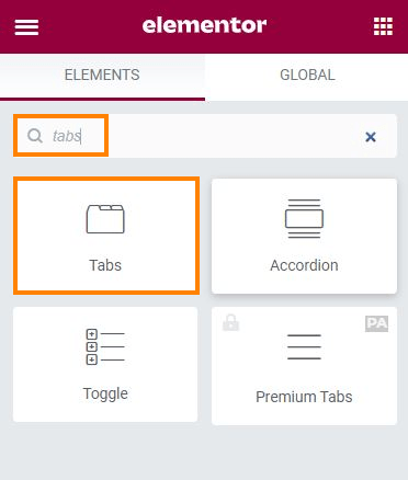
Start by placing the ‘Tab’ widget
Use a ‘tab’ widget and place it on your Elementor page.
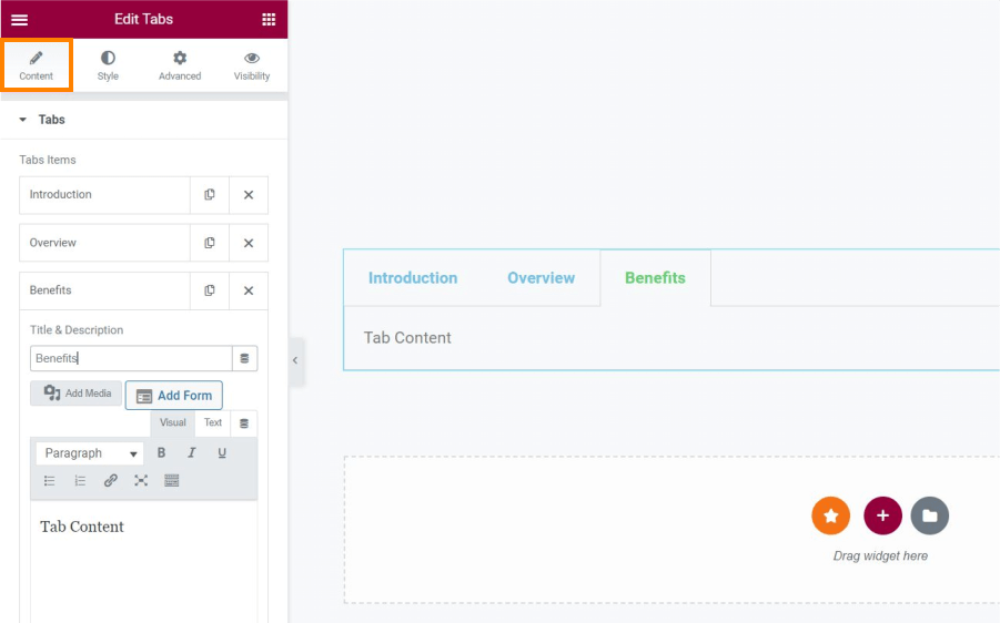
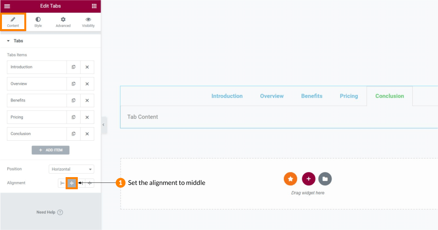
Add as many tab items as you need. In this example, I am using 5 of them. Add their titles and some content to each of them. I won’t go too much into details on how to style the ‘tab’ widget. For now, I will just set the ‘Alignment’ to center in the ‘Content’ tab and remove the border in the ‘Style’ tab.

Switch over to mobile view
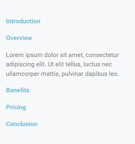
Since we are adjusting our tab for mobile view, switch over to mobile (responsive) view in Elementor. This way we can see what we are doing and how it looks like directly on mobile size. You can see that by default, the tab items are listed in a vertical view with tab titles being in a sort of a vertical list. When we click on a desired tab title to expand the tab item, you can see that the result is not what we want to achieve.
Let’s see how to keep these tab titles on top of our tab element and put the tab titles in horizontal, not vertical view.
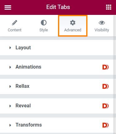
Add the CSS code
Now is the time to add the CSS code to our tab widget. I am using Elementor Pro, so all I need to do to add CSS is head over to my ‘Advanced’ tab and scroll down to the ‘Custom CSS’ field.
I will start by adding the following code:
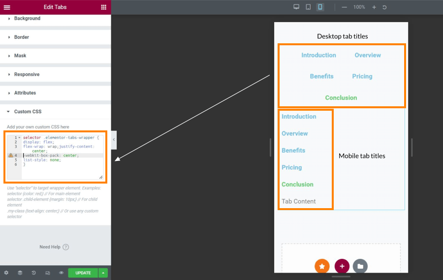
selector .elementor-tabs-wrapper {
display: flex;
}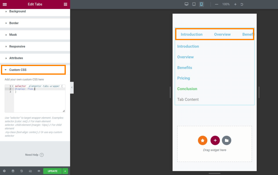
Let me explain what this code does. We are using ‘selector’ since we are typing our CSS directly in the Elementor widget. This way we are telling Elementor to apply our CSS code to that ‘selected’ widget. Then, we will call out the class .elementor-tabs-wrapper and set display to ‘flex’ in order to place our titles next to each other.
Now, don’t worry about having two tab lists at this moment. We will get rid of the second one in a minute.
Let’s see how to fix our tab title list going out of the screen. Currently, we can see only the first tab item titles showing in our horizontal list on top, while the remaining ones are going out of the screen.
Add the following code:
flex-wrap: wrap;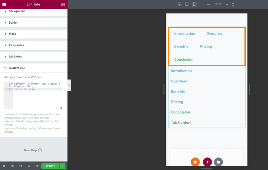
I will now use a little bit of styling to center my titles on the screen:
justify-content: center;
-webkit-box-pack: center;
list-style: none;
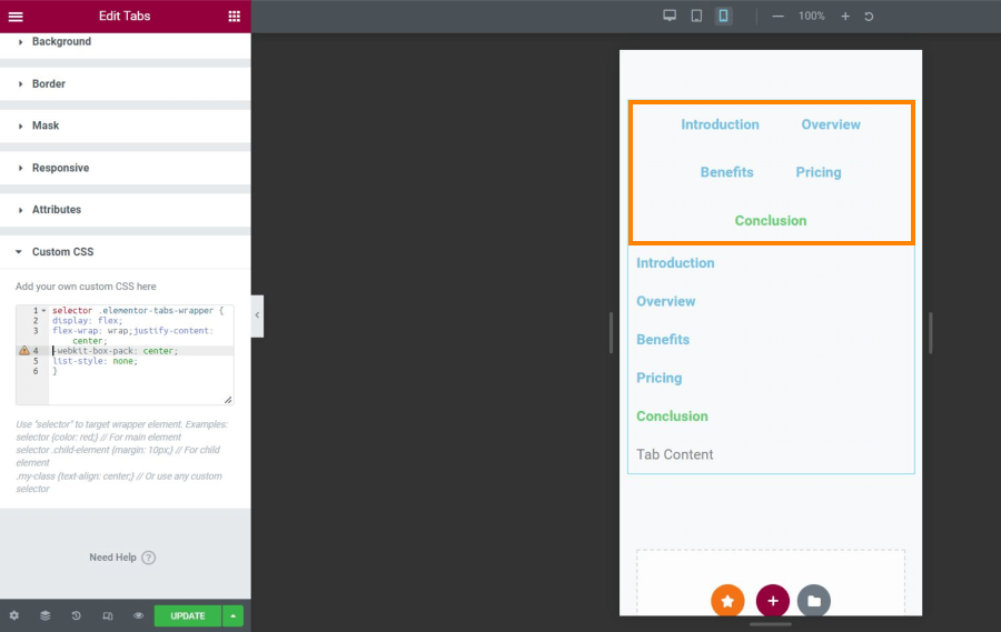
Our final code for now will look like this:
selector .elementor-tabs-wrapper {
display: flex;
flex-wrap: wrap;
justify-content: center;
-webkit-box-pack: center;
list-style: none;
}
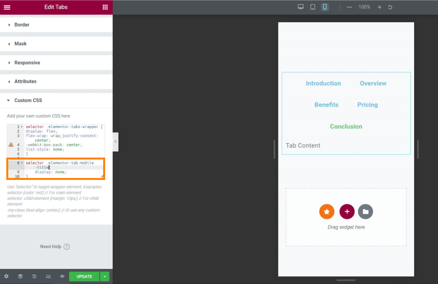
Now let’s get rid of the second vertical tab list that we don’t actually need. In order to do that, I should explain that that second vertical tab elements are actually Elementor tab titles for MOBILE. They have a special class assigned automatically in Elementor, so all we need to do is hide that title class.
We will use this code:
selector .elementor-tab-mobile-title{
    display: none;
}
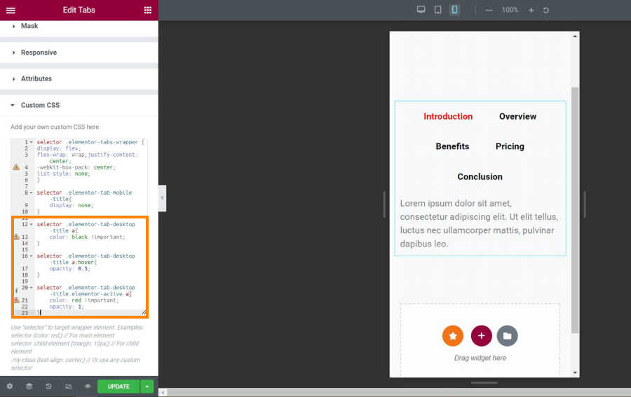
Styling the tab title colors
Now let’s move on to style our tab titles. In order to do that, we will be adding our code to the DESKTOP version of our tab titles. That styling will then apply to both desktop AND mobile view. (Remember that we are not using the ‘mobile’ tab titles that are currently hidden, only the desktop ones are visible)
Let’s make the default color for our titles black:
selector .elementor-tab-desktop-title a{
    color: black !important;
}
Then, I want to edit the hover state of these tab titles. I will make them with lower opacity on hover.
selector .elementor-tab-desktop-title a:hover{
    opacity: 0.5;
}
Next, I will edit the ‘active’ state of my tab titles. This will determine the color (or any other text attribute) of the currently active tab title, once we click on the corresponding tab item.
selector .elementor-tab-desktop-title.elementor-active a{
    color: red !important;
    opacity: 1;
}
Note that I like to also set the opacity in the active tab title state, since we modified the opacity for the hover state of this element. This way I am making sure that the opacity for my active state doesn’t get overridden by previously defined hover state.
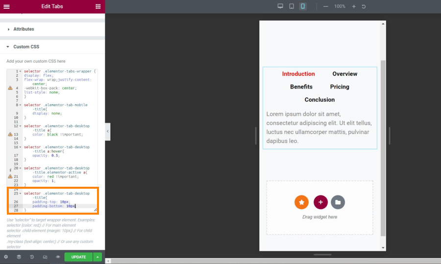
Finally, I will adjust the padding around my titles a bit to reduce the spacing. For that, I will use the following code:
selector .elementor-tab-desktop-title{
    padding-top: 10px;
    padding-bottom: 10px;
}
And that’s it! We have successfully made our tab titles horizontal on mobile and we made them stick on top of our tab elements using these few lines of CSS code.
This is how our final CSS code looks like:
selector .elementor-tabs-wrapper {
display: flex;
flex-wrap: wrap;
justify-content: center;
-webkit-box-pack: center;
list-style: none;
}

selector .elementor-tab-mobile-title{
    display: none;
}

selector .elementor-tab-desktop-title a{
    color: black !important;
}

selector .elementor-tab-desktop-title a:hover{
    opacity: 0.5;
}

selector .elementor-tab-desktop-title.elementor-active a{
    color: red !important;
    opacity: 1;
}

selector .elementor-tab-desktop-title{
    padding-top: 10px;
    padding-bottom: 10px;
}*This post may contain affiliate links. If you click on a link and make a purchase, I will receive a commission from the sale, with no extra cost to you. That way you are supporting my blog and allowing me to keep making videos and posts like this. I only promote products that I use, have experience with and support, such as Elementor Pro.