If you are a starting designer, you might find yourself wondering what all these terms like ‘body copy, kerning and serif’ mean while watching tutorials or reading design blogs. In this post, you can find a cheat sheet with some of the most commonly used terms in design that should clarify it once for all!
Here we go with some fundamental graphic design vocabulary:
Body copy
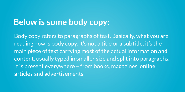
Body copy refers to paragraphs of text. Basically, what you are reading now is body copy. It is not a title or a subtitle, it is the main piece of text carrying most of the actual information and content, usually typed in smaller size and split into paragraphs. It is present everywhere – from books, magazines, online articles and advertisements.
Tracking
Tracking is the spacing between the letters of a word, applied evenly between each letter. You can set the tracking manually when adjusting the text, let’s say in Illustrator. Therefore, it is adjusted by the user in a software or through CSS when building a website. Setting different tracking and applying different spacing between characters can give you more condensed and tense look or more airy and expanded, light feel.
Kerning
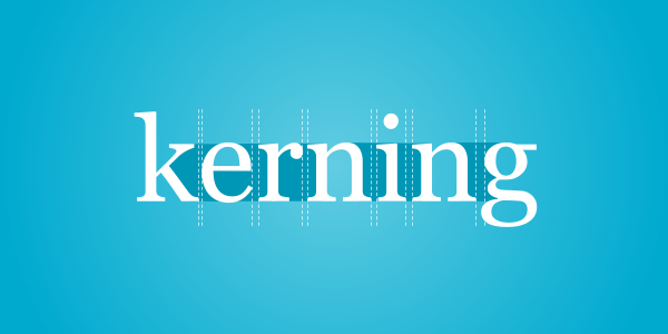
Kerning is the spacing between specific characters to create proportional and harmonious look when they are viewed together in a word. Kerning is specific to selected pairs of letters. For example kerning for ‘A’ and ‘V’ when placed next to each other is different than kerning for ‘A’ and ‘M’. Therefore, it depends on the specific pair of characters next to each other and is adjusted to these specific character pairs.
The point of kerning is not to create equal space between character sets, but to create the illusion that the characters are equally spaced so that they are only perceived as such. Kerning can increase legibility by removing and adjusting the spacing between the characters that would otherwise appear due to the shape of these characters, for instance ‘AW’. Kerning can be adjusted manually and is especially common practice to adjust it for impactful and hero headlines and logotypes. However, if the typeface has been designed correctly, default kerning is typically good enough.
Leading
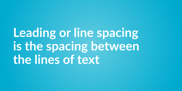
Leading or line spacing is the vertical space between lines of type. Usually, if the text has too condensed leading and the lines are too close together, it will not appear legible and might cause difficulties while reading. For optimal reading experience, keep the leading between 1 and 1.4 x of font size (for example, if your text size is 12pt, don’t make the leading smaller than 12pt for longer body copy).
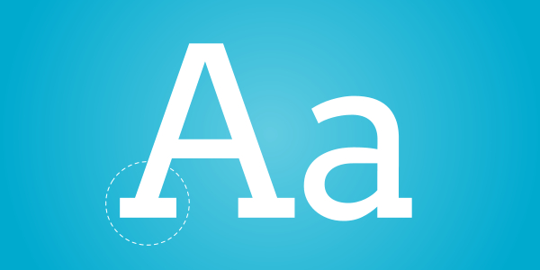
Baseline
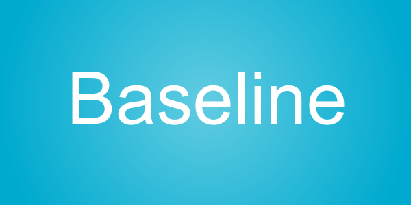
Baseline is the line where your characters sit on. More specifically, it refers to the bottom line where (most of the) capital letters rest on.
Line break
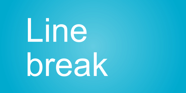
Line break is used at the end of the line to create a new line, but not a new paragraph. That means that a line break will split the text into two lines, but both lines will still be treated as they belong to the same paragraph. Line break will not add white spacing that typically appears when creating a new paragraph. In most editors, you create a line break by pressing ‘Shift+Enter’ and a new paragraph break by pressing ‘Enter’.
Orphan
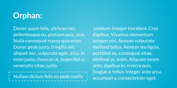
Orphan is a single line of text that starts a paragraph but appears at the bottom of a column or a page.
Widow
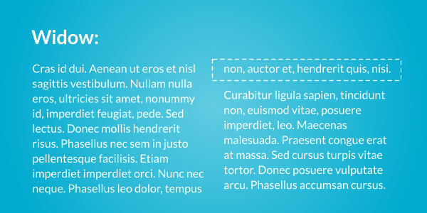
Widow is a single, lonely line of text that ends a paragraph but appears at the beginning of a column or a page. This makes it separated from its native paragraph where it belongs to.
Runt
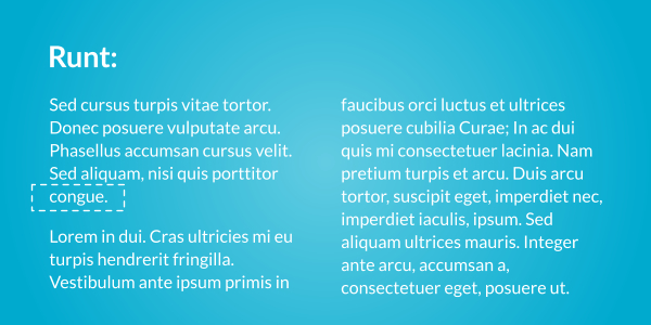
Runt is a single word ending a paragraph that appears as the last line of that paragraph.
Dummy text
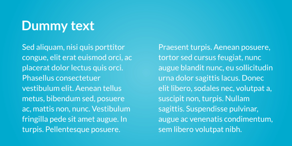
Dummy text or filler text is a random, generic text that’s used for preview purposes or as a placeholder. It shows where and how the real text would look like when the real content is inserted. It is usually used as Lorem Ipsum text in Latin, but can be otherwise generated text in English or any other language.
Hyphenation
Hyphenation refers to breaking of words at the end of a line with a hyphen (‘-‘). Hyphenation is useful when the text is justified. With this justified text, you can increase legibility by avoiding unwanted gaps between the words using hyphenation.
Display typeface
Display typeface is primarily used for large sized, short text, such as headings and titles as opposed to body copy. It therefore has more distinctive appearance and is less sober and ‘ordinary’ than typefaces used for body copy.
Condensed typeface
Condensed typeface has narrower glyphs than other, standard typefaces. Therefore, it appears taller than wider and can fit more content in less space than regular typefaces. That makes it appropriate as a space saving solution.
Script typeface
Script typeface is inspired by handwriting and calligraphy. It can be used as display typeface rather than body of text. Often cursed and with connected glyphs, it evokes more personal touch and often elegant and softer look.
Slab serif typeface
Slab serif typefaces feature thick serifs at the end of strokes of characters. They have a bolder, heavier and less refined look than classic serif typefaces.
Serif typeface

Serif is a small line at the end of a stroke of a character. Serif fonts appear more conservative, but serifs may help lead the eye better when reading bigger chunks of text.
Sans serif typeface
Sans serif typeface is a typeface that doesn’t contain serifs. Therefore they appear more contemporary, clean and minimal, but at the same time are harder to read when applied to larger blocks of text.
All caps
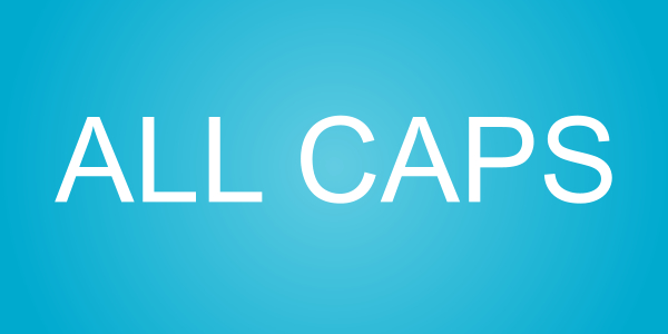
All caps is typographic treatment where all the letters in a word are capitalized.
Sentence case
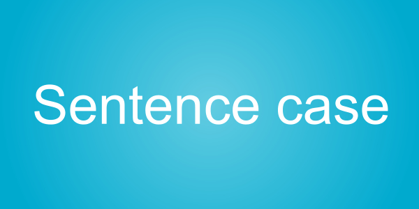
Sentence case is text treatment that capitalizes the first letter of the first word in the text. First letters of certain words, such as proper nouns should also be capitalized regardless.
Title case
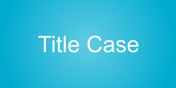
Title case capitalizes the first letters of major words. Shorter or minor words like prepositions and articles are left lowercase.
Glyph
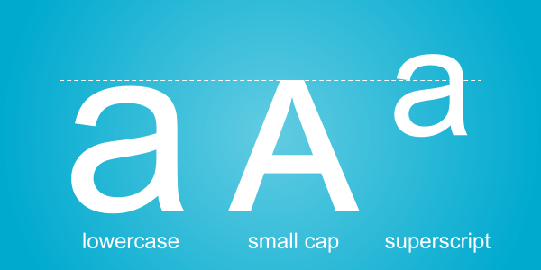
Glyph is a specific symbol representing a character. Therefore, character is a wider term than glyph. For instance, character ‘c’ can have different glyphs in different typefaces that can have different shape and style. Even within the same font, there can be different glyphs for the same character – for example standard lower case, small cap and superscript.
Character
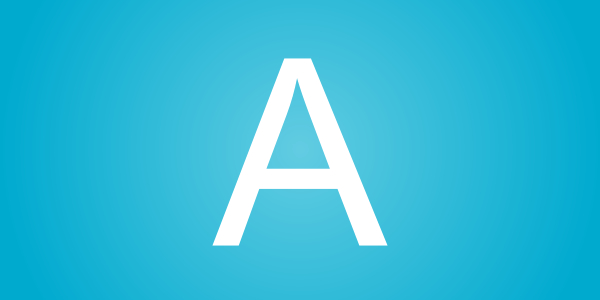
Character is a symbol that represents a letter, punctuation or a numeral. Capitals are considered a different character than their lowercase versions.
Gutter
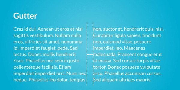
Gutter is spacing between the columns.
Typeface
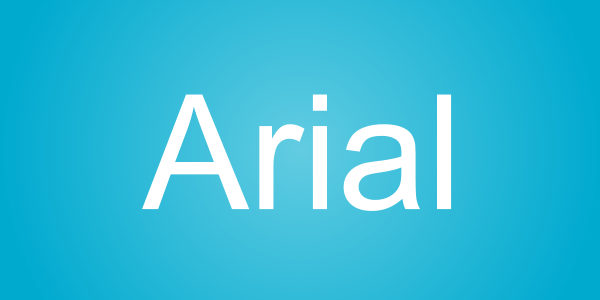
Typeface is a set of characters that share the same design. By characters, we mean letters, symbols, numbers and punctuation. For example, Arial or Calibri is a typeface.
Font
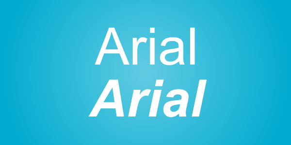
Often mistaken for Typeface, a font is a typeface of specific size, weight and style. For example, Calibri Bold with the size of 16pt is a font, while just Calibri is a typeface. Therefore, typeface is a wider term, while font is kind of a ‘sub-category’ of a typeface.