On this page, you can grab the codes for Elementor tutorials from my channel and use them in your projects. Just adjust the code as necessary, change the class names, colors, pixel values and much more.
Different font sizes on one line in CSS and Elementor
In the ‘Text Editor’ widget in Elementor, go to ‘Content’, switch to ‘Text’ editor instead of Visual and type your text. Then wrap the parts of your text you would like to have bigger in ‘span’ and give it a class name of your choice.
I want <span class="big-text">this part</span> of text to be bigger. And <span class="bigger-text">this part</span> to be even bigger.Then go to CSS (I am using Simple CSS and JS plugin) and give your classes font sizes. You can also change the color, fonts etc.
.big-text {
	font-size: 28px;
}
.bigger-text {
font-size: 38px;
}How to put text in the middle of a circle in CSS and Elementor
Using a text editor widget, type your number, give it a class (in my case, I used the class “bullet-number”) and then head over to your CSS and customize the code below. I am using Simple CSS and JS plugin.
.bullet-number p{
	font-family: 'Roboto', sans-serif;
	font-size: 24px;
	color: #ffffff;
	margin-bottom: 0px;
}

.bullet-number {
	background-color: #41b7e1;
	width: 70px !important;
	height: 70px;
	border-radius: 50%;
	display: flex;
	flex-direction: column;
	justify-content: center;
	align-items: center;
}
Apply gradient to text in CSS and Elementor
Type your text using a Text Editor widget, give it a class (in my case, class “gradient”) and then style your class in CSS:
.gradient p{
	background-image: linear-gradient(to right, rgba(76, 138, 198, 1),rgba(136, 196, 67, 1));
	-webkit-background-clip: text;
	display: inline-block;
	-webkit-text-fill-color: rgba(255, 255, 255, 0);
}
Bullet list with custom bullets in CSS and Elementor
Create a bullet list using a Text Editor widget in Elementor, give it a class (in my case, “bullet-list”) and then head over to Custom CSS plugin and add the code below. Don’t forget to place the URL to your image from your WordPress media in the brackets!
.bullet-list li{
	list-style: none;
	list-style-image: none;
	background: url(https://yoururltotheimagehere.jpg) no-repeat 0 0.2em;
	background-size: 1em;
	padding-left: 1.5em;
}
How to remove line break on mobile and tablet devices in CSS and Elementor
In the text editor widget, add a line break using <br> tags:
This is the first sentence. <br> This is the second sentence on a new line.Then in the ‘Custom CSS’ field, use the code below to remove the line breaks on small screens:
@media (max-width: 1023px){
selector br{
	display: none;
	}
}
How to create text with columns in CSS and Elementor
Type your text in the text editor widget and go to ‘Custom CSS’ field to add the code below:
selector {
	column-count: 2;
	column-gap: 60px;
	width: 900px;
}
Use different fonts in one line in CSS and Elementor
Using a text editor widget, type your text in the ‘Text’ editor, instead of Visual. Use the <span> tags and a class name to wrap the words or pieces of text that you would like to appear in different font:
I want <span class="fancy-text">this text </span> to be fancy.Then go to your CSS and add the code below. I am using Simple CSS and JS plugin and the class name “fancy-text”:
.fancy-text{
	font-family: 'Brush Script MT';
	font-size: 28px;
	color: red;
}
Create EDITABLE circular checkmark bulleted list in Elementor and custom CSS
Create a bullet list using a Text Editor widget in Elementor, add a class name (I am using “bullet-list-checkmark”) and use the code below in your Custom CSS and JS plugin:
.bullet-list-checkmark li{
	font-size: 21px;
	list-style: none;
	list-style-image: none;
	position: relative;
	padding-left: 1.5em;
}

.bullet-list-checkmark li:before{
	content: " ";
	display: block;
	border: solid 0.5em red;
	border-radius: 0.5em;
	position: absolute;
	left: 0px;
	top: 12%;
}

.bullet-list-checkmark li:after{
	content: " ";
	display: block;
	width: 0.3em;
	height: 0.6em;
	border: solid white;
	border-width: 0 0.145em 0.145em 0;
	position: absolute;
	left: 0.35em;
	top: 20%;
	transform: rotate(45deg);
}
How to shrink image on hover using Elementor and custom CSS
Use an image widget to place your image in Elementor and add a class (in my case “image-shrink”). Then go ahead and style that class in Simple Custom CSS and JS plugin:
.image-shrink:hover{
	transform: scale(0.95);
	transition: transform 0.7s ease;
}

.image-shrink {
	transition: transform 0.5s ease;
}
How to use different color for bullet symbol and text in a bullet list in Elementor and CSS
Create a bullet list using a Text editor widget, give it a class name (I am using “bullet-list”) and use the code below in the Custom CSS and JS plugin:
.bullet-list li::marker{
	color: red;
}
If you want to color just a specific bullet (for example the second bullet in the list), use this code:
.bullet-list li:nth-child(2)::marker{
	color: red;
}
Insert inline image or graphics in text in Elementor and CSS
Type your text using a Text editor widget, switch over to the ‘Text’ tab instead of ‘Visual’ and use the code below:
I want my image <img src="https://yourimagelink.png" style="width: 20px; position: relative; top: 4px;">to appear in this text.Trigger a popup with text in CSS and Elementor
First, create a popup in your Elementor Pro and in the ‘Advanced’ section of Popup settings, go to ‘Open by selector’. Type your selector (I am using “.trigger”). Then on your regular page, in your text, use the following code in the ‘Text’ editor instead of ‘Visual’ one:
I want my popup to appear when I click <a class="trigger" href="#"> HERE</a>.Create a button in the middle of the text with Elementor and CSS
In the text editor widget, wrap the word in your text that you want to turn into button into the following piece of code in the ‘Text’ editor instead of ‘Visual’:
Click <a class="my-button" href="https://www.yourlinkhere.com" target="_blank" rel="noopener">here</a> to open a new window.Then go to the CSS and style your class (in my case I used the name “my-button”:
.my-button {
	background-color: red;
	color: white;
	border-radius: 4px;
	padding: 5px 15px;
}
Adjust alignment and spacing in lists in CSS and Elementor
Create an unordered list using the Text Editor widget in Elementor, assign it a class (my class name is “my-list”) and edit that class in CSS:
.my-list ul{
	margin-left: 1em;
	list-style-position: outside;
}

.my-list ul li{
	padding-left: 0.5em;
	margin-bottom: 0.5em;
}

.my-list p{
	margin-bottom: 0.5em;
}
If you are using an ordered list, you can use the same code as above, but instead of ‘ul’, write ‘ol’:
.my-list ol{
	margin-left: 1em;
	list-style-position: outside;
}

.my-list ol li{
	padding-left: 0.5em;
	margin-bottom: 0.5em;
}

.my-list p{
	margin-bottom: 0.5em;
}
Create a short line above text or a title in CSS and Elementor
Type your heading using a heading widget in Elementor and use the following code:
selector::before{
content: ' ';
border-bottom: solid red 6px;
width: 40px;
position: absolute;
margin-top: -0.5em;
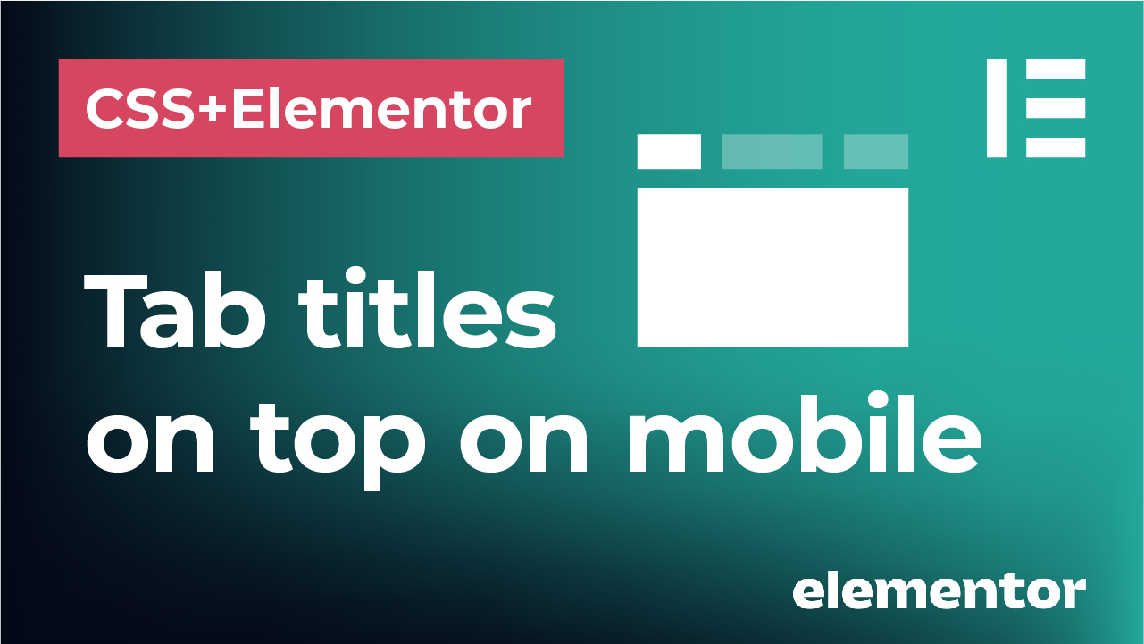
}Horizontal tab titles on mobile in CSS and Elementor
Use the “Tab” widget to create your tab in Elementor. Then go to the ‘Custom CSS’ field of the widget and add the following code:
selector .elementor-tabs-wrapper {
        display: flex;
        flex-wrap: wrap;
        justify-content: center;
        -webkit-box-pack: center;
        list-style: none;
    }

    selector .elementor-tab-desktop-title {
        padding-top: 10px;
        padding-bottom: 10px;
    }

    selector .elementor-tab-mobile-title {
        display: none;
    }

    selector .elementor-tab-desktop-title a:hover {
        opacity: 0.5;
    }

    selector .elementor-tab-desktop-title.elementor-active a{
        color: red !important;
    }

    selector .elementor-tab-desktop-title a{
        color: black !important;
    }
Create a non-breaking hyphen in CSS and Elementor
Write your text using a heading widget for example, and type it wrapping the word that’s using the hyphen in “span” tags as shown below:
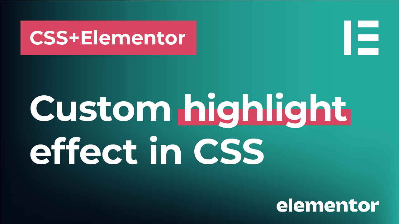
We are working with <span style="white-space: nowrap;">use-cases</span>here.How to make custom highlights in CSS and Elementor
Using the text widget, type your text and in the ‘Text’ editor instead of ‘Visual’, wrap the word that you would like to highlight in <span> tags:
Have a <span> beautiful </span> day!To get the code for the gradient, I am using https://cssgradient.io/
Then go to the ‘Custom CSS’ field if you are using Elementor Pro and using one of the two ways below, create your gradient.
First way:
selector span{
	background: linear-gradient (0deg, rgba(255,255,255,0) 0%, rgba(255,255,255,0) 40%, rgba(246,255,180,1) 40%, rgba(246,255,180,1) 60%, rgba(255,255,255,0) 60%, rgba(255,255,255,0) 100%);
	padding-left: 10px;
	padding-right: 10px;
}
Second way:
selector span::before{
	content: '';
	left: 0px;
	right: 0px;
	background: #ffa290;
	position: absolute;
	height: 20px;
	z-index: -1;
	top: 20px;
}

selector span{
	position: relative;
}
If you are not using Elementor Pro, using the text editor widget, wrap the word in <span> tags in the text, not visual editor and add a class to it:
Have a <span class="thick-line-gradient">beautiful</span> day!Then go to the Custom CSS and JS plugin and style your class as follows for the first way:
.thick-line-gradient{
	background: linear-gradient (0deg, rgba(255,255,255,0) 0%, rgba(255,255,255,0) 40%, rgba(246,255,180,1) 40%, rgba(246,255,180,1) 60%, rgba(255,255,255,0) 60%, rgba(255,255,255,0) 100%);
	padding-left: 10px;
	padding-right: 10px;
}
Or this for the second way:
.thick-line-gradient::before{
	content: '';
	left: 0px;
	right: 0px;
	background: #ffa290;
	position: absolute;
	height: 20px;
	z-index: -1;
	top: 20px;
}

.thick-line-gradient{
	position: relative;
}
How to create mega menu with columns in CSS and Elementor
Use the nav menu widget to place your menu and in the ‘Custom CSS’ field use the code below. Adjust the child elements in the list.
@media (min-width: 1024px) {
    selector .elementor-nav-menu li:nth-child(1) .elementor-nav-menu--dropdown{
    column-count: 2 !important;
}

selector .elementor-nav-menu li:nth-child(1) .elementor-nav-menu--dropdown li:nth-child(5) {
    break-before: column !important;
}

selector .elementor-nav-menu li:nth-child(1) .elementor-nav-menu--dropdown li:nth-child(1) {
    font-size: 21px !important;
}

}
If you are using Elementor FREE, just give your nav menu a class and edit that class in your CSS. I am using Custom CSS and JS plugin and the name of the class “custom-menu”:
@media (min-width: 1024px) {
    .custom-menu .elementor-nav-menu li:nth-child(1) .elementor-nav-menu--dropdown{
    column-count: 2 !important;
}

.custom-menu .elementor-nav-menu li:nth-child(1) .elementor-nav-menu--dropdown li:nth-child(5) {
    break-before: column !important;
}

.custom-menu .elementor-nav-menu li:nth-child(1) .elementor-nav-menu--dropdown li:nth-child(1) {
    font-size: 21px !important;
}

}
How to create square and circular images in CSS and Elementor
Use the image widget to place an image in Elementor and type the following code in the ‘Custom CSS’ field if you are using Elementor Pro:
selector img{
	width: 400px;
	aspect-ratio: 1;
	object-fit: cover;
	border-radius: 50%;
}
If you are not using the Pro version, but Elementor FREE, give your image a class (for example “rounded-image”) and use the same code in the Simple CSS and JS plugin:
.rounded-image img{
	width: 400px;
	aspect-ratio: 1;
	object-fit: cover;
	border-radius: 50%;
}
To create a square image, just remove the border-radius property.
How to create a horizontal list in Elementor and CSS
Using a text editor widget, create an unordered (bullet) list in Elementor. Then go to the ‘Custom CSS’ field if you are using Elementor Pro and add the following code:
selector ul{
	display: flex;
	list-style-type: none;
	padding-left: 0px;
}

selector li{
	padding-right: 40px;
}
If you are using Elementor FREE, give your list a class (for example “horizontal-list”) and use the same code from above in your CSS. I am using Simple CSS and JS plugin:
.horizontal-list ul{
	display: flex;
	list-style-type: none;
	padding-left: 0px;
}

.horizontal-list li{
	padding-right: 40px;
}
How to create an ordered list with numbers in circles in CSS and Elementor
Create an ordered list using a text editor widget in Elementor and add the code in the Custom CSS field:
selector li{
	font-size: 22px;
	color: black;
	font-weight: 600 !important;
	line-height: 2em;
	position: relative;
	padding-left: 0.8em;
}

selector li::before{
	content: "";
	background-color: red;
	position: absolute;
	display: inline-block;
	width: 1.6em;
	height: 1.6em;
	border-radius: 50%;
	z-index: -1;
	left: -1.5em;
	top: 0.2em;
}

selector li::marker{
	color: white;
}
If you are using Elementor FREE, give your list a class (for example “circular-list”) and use the same code from above in your CSS. I am using Simple CSS and JS plugin:
.circular-list li{
	font-size: 22px;
	color: black;
	font-weight: 600 !important;
	line-height: 2em;
	position: relative;
	padding-left: 0.8em;
}

.circular-list li::before{
	content: "";
	background-color: red;
	position: absolute;
	display: inline-block;
	width: 1.6em;
	height: 1.6em;
	border-radius: 50%;
	z-index: -1;
	left: -1.5em;
	top: 0.2em;
}

.circular-list li::marker{
	color: white;
}
Create custom graphics above titles in CSS and Elementor
Create a heading using a Heading widget (for example Heading 2 or h2) in Elementor and add the following code in the Custom CSS field. Don’t forget to change the h2 selector – if you are using Heading 5 for instance, write h5 instead:
selector h2::before{
	content: ' ';
	background-image: url('https://yourimagelink.svg');
	background-repeat: no-repeat;
	background-size: contain;
	background-position: center center;
	position: absolute;
	width: 80px;
	height: 25px;
	top: -30px;
	left: -20px;
}
If you are using a FREE version of Elementor, you can add the same code to your heading class in the custom CSS:
h2::before{
	content: ' ';
	background-image: url('https://yourimagelink.svg');
	background-repeat: no-repeat;
	background-size: contain;
	background-position: center center;
	position: absolute;
	width: 80px;
	height: 25px;
	top: -30px;
	left: -20px;
}
How to put images in semi circle and quarter circle in CSS and Elementor
Place an image on your Elementor page using an Image widget. In the Custom CSS field add the following code to add a semi circular image:
selector img{
	width: 300px;
	height: 150px;
	object-fit: cover;
	border-radius: 150px 150px 0px 0px;
}
To create a quarter circle of an image, use the following code:
selector img{
	width: 400px;
	aspect-ratio: 1;
	object-fit: cover;
	border-radius: 100% 0% 0% 0%;
}
How to create custom image masks with PNG layers in CSS and Elementor
Use an image widget to place the image on your Elementor page. This is the image that will be showing through your mask, not the mask itself. Go to the Custom CSS field and add the following code:
selector img{
	-webkit-mask-image: url(https://yourimagemask.png);
	mask-image: url(https://yourimagemask.png);
	-webkit-mask-size: 600px;
	mask-size: 600px;
	-webkit-mask-repeat: no-repeat;
	mask-repeat: no-repeat;
	-webkit-mask-position: center center;
	mask-position: center center;
}
If you are using a FREE version of Elementor, give your image a class (for example “image-mask”) and add the same code in your custom CSS plugin. I am using Custom CSS and JS plugin.
.image-mask img{
	-webkit-mask-image: url(https://yourimagemask.png);
	mask-image: url(https://yourimagemask.png);
	-webkit-mask-size: 600px;
	mask-size: 600px;
	-webkit-mask-repeat: no-repeat;
	mask-repeat: no-repeat;
	-webkit-mask-position: center center;
	mask-position: center center;
}
How to create custom image masks with linear gradients in Elementor and CSS
Use the Image Widget to place an image on your Elementor page. Then type the following code in the Custom CSS field if you are using Elementor Pro:
selector img{
	mask-image: linear-gradient(270deg,black 70%,transparent 100%);
	-webkit-mask-image: linear-gradient(270deg,black 70%,transparent 100%);
	width: 400px;
}
How to create custom image masks with text layers in Elementor and CSS
Use the text editor widget to place the text on your Elementor page. In the Custom CSS field of your Elementor Pro, type the following code:
selector {
	background-image: url(https://yourimagelink.jpg);
	background-size: cover;
	background-clip: text;
	-webkit-background-clip: text;
	color: transparent !important;
	background-position: 0px -280px;
}
If you are using Elementor FREE, give your image a class (for example “image-clip”) and add the same code in your CSS plugin:
.image-clip {
background-image: url(https://yourimagelink.jpg);
background-size: cover;
background-clip: text;
-webkit-background-clip: text;
color: transparent !important;
background-position: 0px -280px;
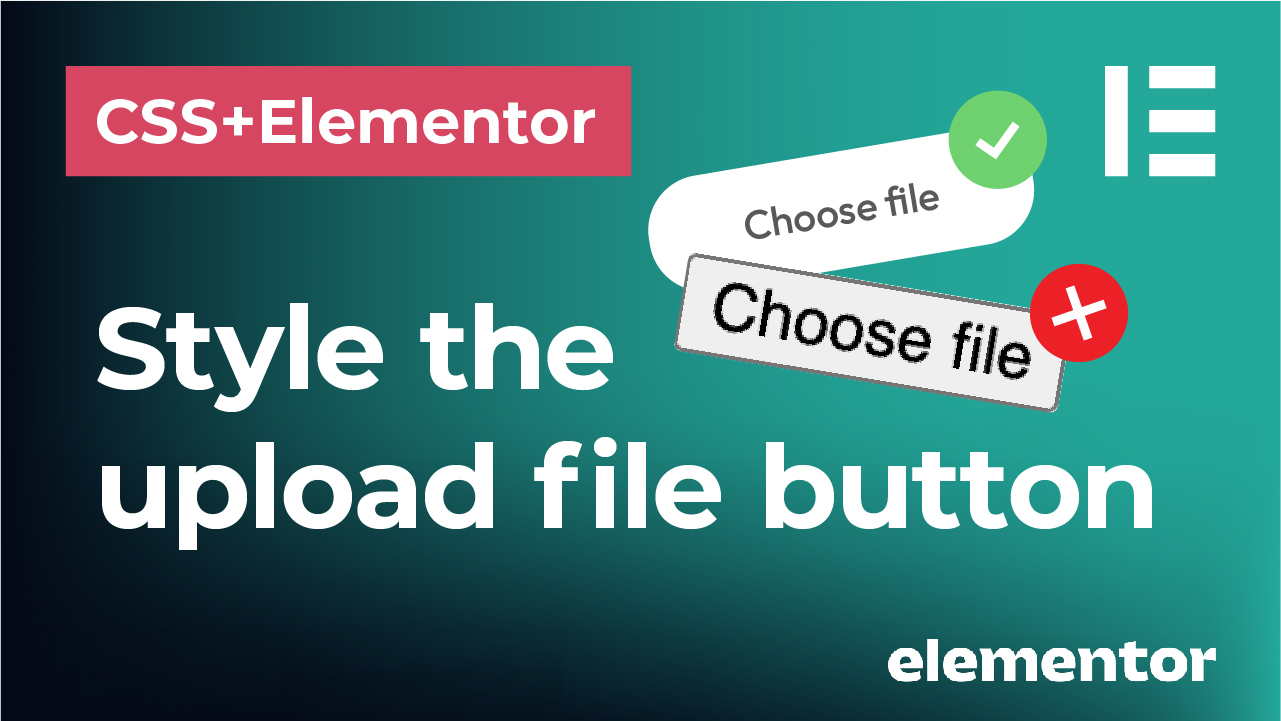
}Style the file upload button in Elementor forms and CSS
Use the form widget in Elementor Pro to add a form and use the ‘File Upload’ item to add the upload button to the form. In the Advanced panel add the CSS class to your form (for example, I am using ‘upload-form’). Then add the following custom CSS code – I am using custom CSS and JS plugin:
.upload-form .elementor-field-type-upload input[type="file"]::file-selector-button {
border: 0px solid #CCC;
border-radius: 20px;
background-color: #f0f0f0 !important;
padding: 10px 20px;
font-size: 14px;
font-weight: 700;
font-family: 'Open Sans', sans-serif;
margin-right: 15px;
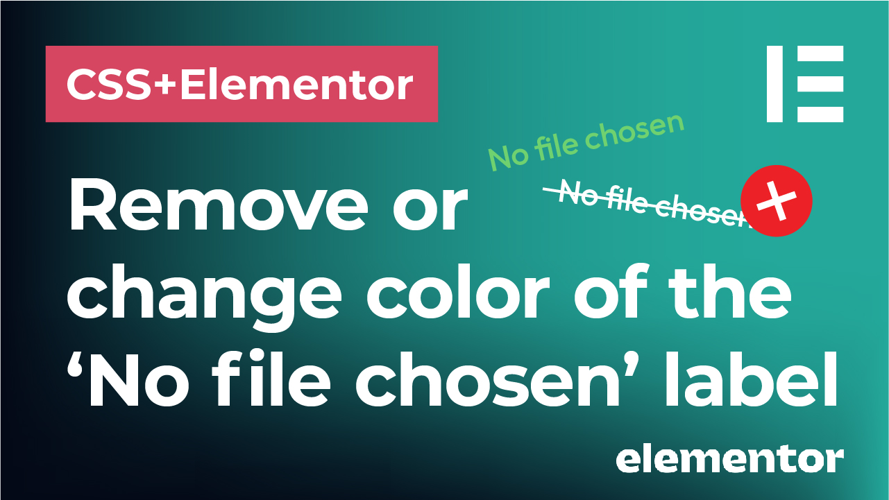
}How to change the color or remove the ‘No file chosen’ label of the file upload button in Elementor forms using CSS
Use the form widget in Elementor Pro to add a form and use the ‘File Upload’ item to add the upload button to the form. In the Advanced panel add the CSS class to your form (for example, I am using ‘upload-form’).
To change the ‘No file chosen’ label color, add the following custom CSS code – I am using custom CSS and JS plugin.
.upload-form .elementor-field-type-upload input[type="file"]{
    color: red !important;
}
To remove (hide) the ‘No file chosen’ label:
.upload-form .elementor-field-type-upload input[type="file"]{
    font-size: 0px !important;
}
Change the text for the file upload button and label in Elementor forms using CSS
Use the form widget in Elementor Pro to add a form and use the ‘File Upload’ item to add the upload button to the form. In the Advanced panel add the CSS class to your form (for example, I am using ‘upload-form’). Then add the following custom CSS code – I am using custom CSS and JS plugin. Here I am changing the text to ‘Browse files’ but you can alter it to anything you want.
.upload-form .elementor-field-type-upload input[type="file"]::before{
    content: 'Browse files';
    background-color: grey;
    padding: 10px 15px;
    border-radius: 20px;
    color: white;
    font-size: 14px;
    line-height: 3em !important;
    font-family: 'Open Sans', sans-serif;
    font-weight: 600;
}

.upload-form .elementor-field-type-upload input[type="file"]::after{
    content: 'You have not chosen any files yet';
    font-size: 14px !important;
    padding-left: 10px;
}

.upload-form .elementor-field-type-upload input[type="file"]{
    font-size: 0px;
}

.upload-form .elementor-field-type-upload input[type="file"]::file-selector-button{
    display: none;
}
Add a custom icon to the file upload button in Elementor forms and CSS before or after the text
The first way
In the first way, use the code from the previous tutorial (see above) to change the text of the file upload button to anything you want but adding an icon from the FontAwesome font before the actual button text. I am using ‘Browse files’ text:
.upload-form .elementor-field-type-upload input[type="file"]::before{
    content: '\f093' '  Browse files';
    background-color: grey;
    padding: 15px 15px;
    border-radius: 25px;
    color: white;
    font-size: 15px;
    line-height: 1em !important;
    font-family: FontAwesome, Open Sans;
    font-weight: 400;
    display: inline-block;
}

.upload-form .elementor-field-type-upload input[type="file"]::after{
    content: 'You have not chosen any files yet';
    font-size: 14px !important;
    padding-left: 10px;
}

.upload-form .elementor-field-type-upload input[type="file"]{
    font-size: 0px;
}

.upload-form .elementor-field-type-upload input[type="file"]::file-selector-button{
    display: none;
}
The second way
In the second way, you can use a custom svg icon that you uploaded in your WordPress media:
.upload-form .elementor-field-type-upload input[type="file"]::before{
    content: url('place the link to your svg icon in your media here') '  Browse files';
    background-color: grey;
    padding: 10px 15px;
    border-radius: 25px;
    color: white;
    font-size: 15px;
    font-family: Open Sans;
    font-weight: 400;
    display: inline-block;
}

.upload-form .elementor-field-type-upload input[type="file"]::after{
    content: 'You have not chosen any files yet';
    font-size: 14px !important;
    padding-left: 10px;
}

.upload-form .elementor-field-type-upload input[type="file"]{
    font-size: 0px;
}

.upload-form .elementor-field-type-upload input[type="file"]::file-selector-button{
    display: none;
}
The third way
The third way is using a custom svg icon as a background – my preferred way.
.upload-form .elementor-field-type-upload input[type="file"]::before{
    content: 'Browse files';
    background-color: grey;
    background-image: url('place the link to your svg icon in your media here');
    background-size: 20px 20px;
    background-repeat: no-repeat !Important;
    background-position: 15px 11px;
    padding: 10px 20px 10px 45px;
    border-radius: 25px;
    color: white;
    font-size: 15px;
    font-family: Open Sans;
    font-weight: 400;
    display: inline-block;
}

.upload-form .elementor-field-type-upload input[type="file"]::after{
    content: 'You have not chosen any files yet';
    font-size: 14px !important;
    padding-left: 10px;
}

.upload-form .elementor-field-type-upload input[type="file"]{
    font-size: 0px;
}

.upload-form .elementor-field-type-upload input[type="file"]::file-selector-button{
    display: none;
}
How to style radio and checkmark field box in CSS and Elementor forms
Use the form widget in Elementor Pro to add a form and use the ‘radio’ item to add the radio boxes to the form. You can also use the checkmark boxes. The difference between radio and checkmark box is that the radio box allows you to check only one option, while with checkmark boxes, you can choose multiple options.
In the Advanced panel add the CSS class to your form (for example, I am using ‘upload-form’). Then add the following custom CSS code – I am using custom CSS and JS plugin.
/* This hides the default radio box circles */
.upload-form .elementor-field-option input[type="radio"] {
    display: none !important;
}


/* This customizes the color of your labels */
.upload-form .elementor-field-option label{
    color: black !important;
}


/* This adds the custom radio box circles for unchecked and checked states */
.upload-form .elementor-field-option input ~ label::before{
	content: '\00a0';
	display: inline-block;
	width: 20px;
	height: 20px;
	border-radius: 50%;
	border: 2px solid blue !important;
	margin-right: 10px !important;
	font-size: 14px !important;
	line-height: 17px !important;
}


/* This customizes only the checked state of the radio box circle */
.upload-form .elementor-field-option input:checked ~ label::before{
	background-color: blue;
	box-shadow: inset 0px 0px 0px 3px white !important;
}


/* This adjustes the spacing between the options */
.upload-form .elementor-field-option{
    margin-bottom: 2px !important;
}
For checkbox, just simply replace type=”radio” with type=”checkbox” in the code provided. So for example to hide the default box, use this:
.upload-form .elementor-field-option input[type="checkbox"]{
	display: none !important;
}
Style radio and checkmark field box in CSS and Elementor forms with custom icons
To add a custom icon, instead of just simple filled circle to your radio boxes, add the following code using one of the ways below:
First way – using a FontAwesome icon:
/* This hides the default radio box circles */
.upload-form .elementor-field-option input[type="radio"] {
    display: none !important;
}

/* This customizes the color of your labels */
.upload-form .elementor-field-option label{
    color: black !important;
}


/* This adds the custom radio box circles for unchecked and checked states */
.upload-form .elementor-field-option input ~ label::before{
	content: '\00a0';
        font-family: 'FontAwesome';
	display: inline-block;
	width: 20px;
	height: 20px;
	border-radius: 50%;
	border: 2px solid blue !important;
	margin-right: 10px !important;
	font-size: 14px !important;
	line-height: 17px !important;
}


/* This customizes only the checked state of the radio box circle */
.upload-form .elementor-field-option input:checked ~ label::before{
	content: '\f00c';
	color: blue;
}


/* This adjustes the spacing between the options */
.upload-form .elementor-field-option{
    margin-bottom: 2px !important;
}
Second way – using a custom svg icon from your WordPress media library:
/* TO ADD A COMPLETELY CUSTOM SVG ICON FROM YOUR WP LIBRARY */

/* This hides the default radio box circles */
.upload-form .elementor-field-option input[type="radio"]{
    display: none !important;
}

/* This customizes the color of your labels */
.upload-form .elementor-field-option label{
    color: black !important;
}


/* This adds the custom radio box circles for unchecked and checked states */
.upload-form .elementor-field-option input ~ label::before{
    content: '\00a0';
    font-family: 'FontAwesome';
    display: inline-block;
    width: 20px;
    height: 20px;
    border-radius: 50%;
    border: 2px solid black !important;
    font-size: 14px !important;
    line-height: 17px !important;
    margin-right: 10px !important;
}


/* This customizes only the checked state of the radio box circle */
.upload-form .elementor-field-option input:checked ~ label::before{
    content: '\00a0';
    background-image: url('https://youriconlinkhere.svg');
    background-repeat: no-repeat;
    background-size: cover !important;
}


/* This adjustes the spacing between the options */
.upload-form .elementor-field-option{
    margin-bottom: 2px !important;
}
For checkbox, just simply replace type=”radio” with type=”checkbox” in the code provided. So for example to hide the default box, use this:
.upload-form .elementor-field-option input[type="checkbox"]{
	display: none !important;
}
How to style form fields in Elementor with CSS
Use the form widget in Elementor Pro to add a form and in the Advanced panel add the CSS class to your form (for example, I am using ‘upload-form’). Then add the following custom CSS code – I am using custom CSS and JS plugin.
.upload-form .elementor-field-textual {
	border-radius: 10px;
	border: 0px solid red !important;
	background-color: #f0f0f0 !important;
	margin-top: 8px;
	margin-bottom: 12px;
}

.upload-form .elementor-field-label{
	font-size: 14px;
	font-family: 'Open Sans', sans-serif !important;
	font-weight: 600 !important;
}

.upload-form .elementor-field {
	font-size: 14px;
	font-weight: 400 !important;
	font-family: 'Open Sans', sans-serif !important;
}

.upload-form .elementor-button[type="submit"]{
	background-color: #e56458 !important;
	border-radius: 20px !important;
	font-family: 'Open Sans', sans-serif !important;
	font-size: 16px;
	font-weight: 600;
}